Color contrast is a fundamental element in the field of design, particularly within creative studios and their exploration of color theory. The effective use of color combinations can greatly impact the visual appeal and communication power of any artistic creation. For instance, imagine a hypothetical scenario where a graphic designer is tasked with creating an eye-catching poster for a music festival. By strategically employing contrasting colors, such as pairing warm tones like red and orange with cool tones like blue and green, the designer can elevate the overall aesthetic appeal of the poster, capture attention, and effectively convey the energetic atmosphere of the event.
Understanding how color combinations work harmoniously or create tension is essential for designers to achieve their desired outcomes. This article aims to delve into the intricate world of color contrast by exploring various aspects such as complementary colors, analogous colors, triadic schemes, and more. By examining real-life examples from renowned design studios, we will analyze how these professionals utilize different color combinations to evoke specific emotions or highlight important elements in their creations. Furthermore, this discussion will also explore practical tips on selecting appropriate palettes based on factors such as target audience preferences and cultural associations – ultimately enabling designers to make informed decisions when it comes to incorporating color contrast principles into their own works.
Understanding the Basics of Color Contrast
To fully appreciate the significance of color contrast in design, let us consider a hypothetical scenario. Imagine an advertising campaign for a new line of luxury watches. The creative studio tasked with developing this campaign must carefully select colors that will not only capture attention but also convey a sense of sophistication and elegance. This example highlights the essential role color plays in influencing how we perceive visual information.
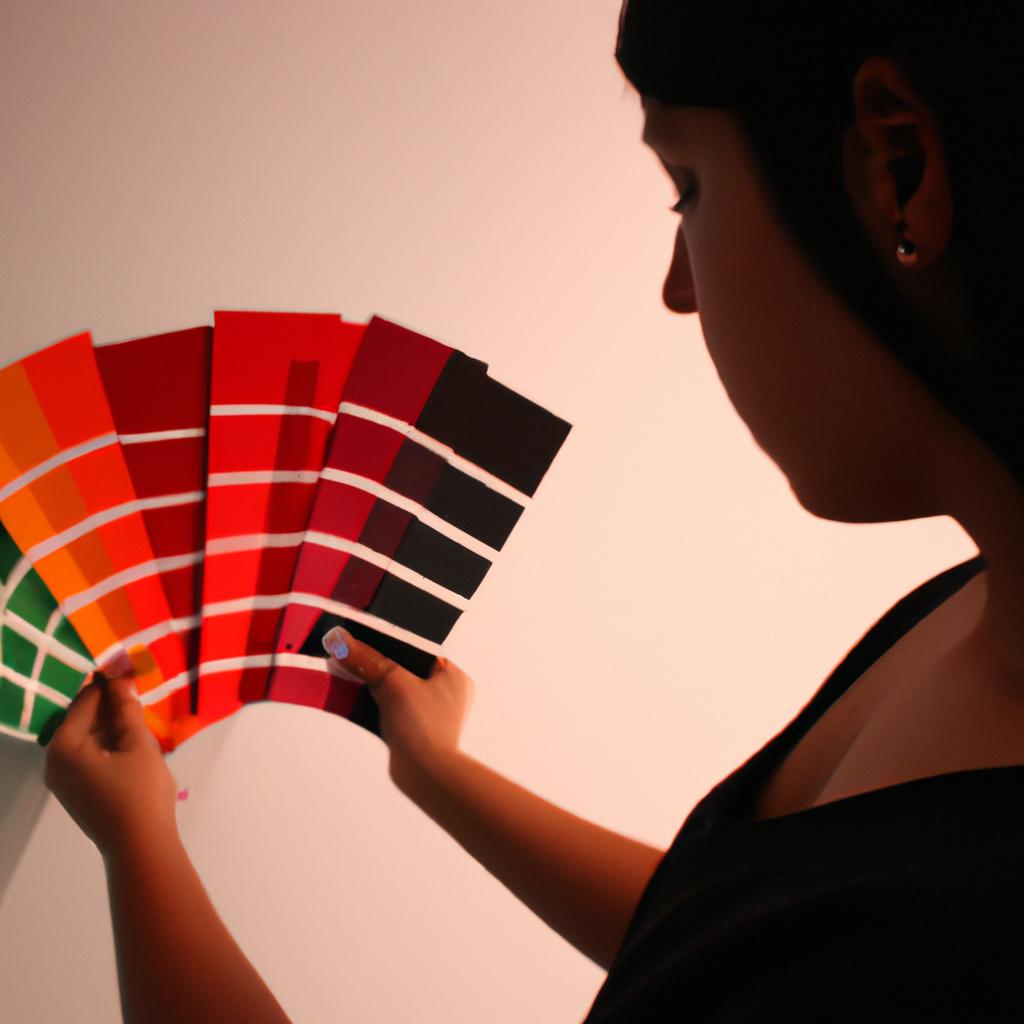
Color contrast refers to the juxtaposition of different hues to create visual interest and enhance legibility. It is crucial to understand the basics of color theory when utilizing color contrast effectively. One key aspect is understanding how colors interact with each other on the color wheel. Colors that are opposite each other on the wheel are known as complementary colors; they tend to create strong, vibrant contrasts when used together.
In exploring the impact of complementary colors, it becomes evident that certain combinations evoke specific emotions or moods within viewers. For instance, pairing warm tones like red and yellow creates a feeling of energy and excitement, while combining cool tones like blue and green evokes a sense of calmness and tranquility. Harnessing these emotional responses can greatly influence the overall message conveyed by a design.
Consider the following examples:
- Passion: A bold combination of deep red against pure white immediately draws attention, conveying passion and intensity.
- Harmony: Utilizing various shades of green alongside soft pastel pinks creates a harmonious palette associated with nature and serenity.
- Contrast: Boldly contrasting black and yellow can produce a striking effect that captures immediate attention due to its high visual contrast.
- Sophistication: Combining rich royal purple with shimmering gold conveys opulence and adds an air of sophistication to any design.
Table: Emotional Responses Elicited by Different Combinations
| Combination | Emotion/Mood |
|---|---|
| Red & Yellow | Energy/Excitement |
| Blue & Green | Calmness/Tranquility |
| Black & Yellow | High Visual Contrast |
| Purple & Gold | Opulence/Sophistication |
By understanding the principles of color contrast and its impact on emotional responses, designers can create visually captivating compositions that effectively convey their intended messages.
Next Section: Exploring the Impact of Complementary Colors
Exploring the Impact of Complementary Colors
Consider a scenario where a creative studio is tasked with designing a logo for a new coffee shop. The client wants the logo to convey warmth, friendliness, and evoke an inviting atmosphere. In order to achieve this goal, the studio decides to explore the use of analogous colors in their design.
Analogous color schemes consist of hues that are adjacent to each other on the color wheel. They share similar characteristics and create harmonious combinations when used together. By selecting colors within close proximity, designers can effectively establish visual coherence and balance in their designs.
Utilizing analogous colors offers several benefits:
- Enhanced harmony: When using analogo
Utilizing Analogous Colors for Harmonious Designs
Complementary colors, when used effectively in design, can create a striking visual impact. By pairing hues that are opposite on the color wheel, designers can achieve a sense of balance and harmony while also creating contrast that catches the viewer’s attention.
To illustrate this concept, let’s consider an example: a website for an upscale restaurant. The designer decides to use blue as the primary color scheme, but wants to add some excitement and energy to the overall aesthetic. They introduce complementary accents by incorporating pops of orange throughout the site. This combination not only adds vibrancy but also creates a dynamic contrast between warm and cool tones.
When utilizing complementary colors in design, it is important to keep certain considerations in mind:
- Balance: While contrasting colors bring dynamism to a composition, maintaining visual equilibrium is crucial. Achieve this by using complementary colors strategically – highlight key elements or focus areas with these hues rather than saturating the entire design.
- Context: Understand how different industries and target audiences respond to particular color combinations. Complementary colors may evoke specific emotions depending on cultural associations or personal preferences, so tailor your choices accordingly.
- Accessibility: Ensure that text remains legible against background colors by applying proper color contrast ratios. Consider accessibility guidelines like WCAG (Web Content Accessibility Guidelines) to make sure your design is inclusive and readable for all users.
- Brand Identity: Complementing existing brand elements with suitable pairs of contrasting colors helps reinforce recognition and consistency across different touchpoints.
By carefully employing complementary colors in your designs, you can enhance visual interest and captivate viewers’ attention through harmonious yet distinctive pairings.
Analogous color schemes offer another approach to achieving harmony in design compositions. These schemes involve selecting adjacent hues on the color wheel that share similar undertones or characteristics. When combined thoughtfully, analogous colors create a cohesive and pleasing visual experience.
For example, imagine a company specializing in eco-friendly products. The designer decides to use an analogous color scheme consisting of various shades of green and blue. This choice reflects the natural and sustainable aspects of their brand identity while maintaining a harmonious aesthetic throughout their marketing materials.
When working with analogous colors, keep these principles in mind:
- Gradation: Explore different tints, tones, and shades within your chosen range to add depth and variation to your design. Varying the saturation or lightness can create interesting effects while still preserving the overall harmony.
- Accents: Introduce small pops of complementary or contrasting colors to break up monotony within the analogous scheme. These accents help draw attention to specific elements or provide subtle contrasts that enhance visual interest.
- Mood and Emotion: Analogous color schemes often evoke specific moods or emotions based on cultural associations – for instance, warm hues like reds and oranges may convey energy or passion, while cool blues and greens may inspire calmness or tranquility. Consider how you want your audience to feel when selecting your palette.
| Hue | Hex Code | Emotional Response |
|---|---|---|
| Green | #00FF00 | Refreshing |
| Blue-Green | #008080 | Soothing |
| Blue | #0000FF | Trustworthy |
Continuing our exploration into effective color combinations, let’s now discuss triadic color schemes. Derived from equally spaced hues on the color wheel, triadic schemes offer vibrant yet balanced options for capturing viewers’ attention.
One such example is a poster promoting a music festival. By employing a triadic scheme comprising yellow-orange, blue-violet, and red-green as dominant colors, the designer achieves both lively contrast and cohesion within the composition. This combination ensures each hue stands out individually while maintaining an overall sense of visual harmony.
In the upcoming section, we will delve deeper into the intricacies of triadic color schemes and explore how they can be utilized to create captivating visuals. By understanding the principles behind these schemes, designers can expand their creative palette and further enhance their ability to engage viewers through effective color choices.
Creating Visual Interest with Triadic Color Schemes
In the previous section, we explored how creative studios can effectively use analogous colors to create harmonious designs. Now, let’s delve into another powerful color combination technique: triadic color schemes. By using three equally spaced colors on the color wheel, designers can achieve vibrant and visually interesting compositions.
Imagine a scenario where a graphic design studio is tasked with creating a promotional poster for a music festival. To ensure an energetic and captivating design, they decide to employ a triadic color scheme consisting of red, yellow, and blue. This combination not only adds visual interest but also creates a sense of balance and harmony in the overall composition.
To better understand the impact of triadic color schemes, let’s explore some key characteristics:
- Vibrancy: Triadic color combinations inherently generate excitement and energy due to the high contrast between three distinct hues.
- Balance: The equal spacing between colors ensures that no single hue dominates the composition, resulting in a well-balanced arrangement.
- Versatility: Triadic color schemes offer ample opportunities for creativity as they allow designers to work with various shades, tints, and tones within each chosen hue.
- Unity: While triadic combinations are bold, properly balancing their intensity helps achieve a cohesive look and feel throughout the design.
To illustrate this further, consider the following table showcasing different variations of our hypothetical music festival poster:
| Variation | Color Combination |
|---|---|
| 1 | Red (primary), Yellow (secondary), Blue (tertiary) |
| 2 | Orange (primary), Green (secondary), Purple (tertiary) |
| 3 | Cyan (primary), Magenta (secondary), Yellow (tertiary) |
| 4 | Violet (primary), Chartreuse green(secondary), Vermilion(red-orange)(tertiary) |
By exploring these different combinations, designers can evoke varying emotional responses from the audience. For example, Variation 1 with red, yellow, and blue may convey a sense of excitement and energy associated with music festivals.
Through this exploration, designers can enhance their ability to create visually captivating designs that engage viewers on multiple levels.
Experimenting with Split Complementary Color Palettes
Building upon the concept of creating visual interest with triadic color schemes, we now delve into another captivating technique known as split complementary color palettes. By exploring this approach, designers can further expand their creative repertoire and achieve visually striking compositions. Let us examine how this method works and its potential benefits in enhancing artistic expression.
Split complementary color palettes involve choosing a base color and then selecting two colors adjacent to its complement on the color wheel. This creates a harmonious yet dynamic combination that adds depth and complexity to any design project. To illustrate, imagine a hypothetical scenario where a graphic designer is tasked with creating an eye-catching poster for a music festival. They decide to use a vibrant red-orange hue as their base color and select blue-green and yellow-green as the accompanying tones. This split complementary palette would effectively bring out the intensity of the red-orange while maintaining balance through its contrasting hues.
To better understand the advantages of using split complementary palettes, consider the following emotional responses they can evoke:
- Excitement: The contrast between warm and cool colors generates energy and stimulates excitement.
- Harmony: Combining analogous shades with one accent color creates a sense of unity within diversity.
- Contrast: The juxtaposition of contrasting hues enhances visual impact by emphasizing differences.
- Depth: Split complementary palettes add depth to designs by incorporating multiple layers of colors.
Table example:
| Base Color | Complementary Colors |
|---|---|
| Red | Cyan, Yellow |
| Blue | Orange, Green |
| Yellow | Violet, Blue-Green |
Bullet point list example:
- Engages viewers through exciting combinations
- Creates harmony among diverse hues
- Enhances visual impact with contrasting shades
- Adds depth through layered compositions
In summary, split complementary color palettes offer designers a versatile tool to create visually stunning artworks. By carefully selecting colors from opposite sides of the spectrum while considering their adjacency, one can achieve a harmonious balance that captivates viewers. Transitioning into the subsequent section about achieving balance with monochromatic color combinations, we explore another method to further enhance visual appeal through simplicity and elegance.
Achieving Balance with Monochromatic Color Combinations
Transitioning from the previous section on experimenting with split complementary color palettes, let us now delve into achieving balance with monochromatic color combinations. Monochromatic color schemes involve using variations of a single hue to create a harmonious and unified visual composition. By exploring this approach, designers can effectively manipulate contrast and tonal values to evoke specific emotions and convey their intended messages.
To illustrate the impact of monochromatic color combinations, consider the following example: A creative studio is tasked with designing an advertisement for a luxury watch brand that aims to exude elegance and sophistication. The design team decides to use a monochromatic scheme based on varying shades of deep navy blue. This choice creates a sense of calmness and stability while evoking feelings of trustworthiness and timelessness, aligning perfectly with the brand’s desired image.
When working with monochromatic colors, designers must pay attention to several key considerations:
- Contrast within the chosen hue: Varying levels of lightness or darkness within the same hue can be utilized strategically to generate depth and interest in the design.
- Texture and pattern usage: Incorporating diverse textures or patterns allows designers to add visual complexity without compromising the overall unity of the composition.
- Use of accent colors: Introducing subtle accents in complementary hues can help prevent monotony, providing focal points or highlighting important elements.
- Emotional response: Different hues have inherent psychological associations; understanding these associations enables designers to elicit specific emotional responses from viewers.
In addition to these factors, designers may find it helpful to refer to a table showcasing various emotions associated with different colors:
| Color | Emotion |
|---|---|
| Red | Passion |
| Blue | Trust |
| Yellow | Happiness |
| Green | Relaxation |
By considering both theoretical principles and practical applications, designers can utilize monochromatic color combinations effectively. Such combinations can evoke strong emotions, create a cohesive visual experience, and ensure that the intended message of the design is conveyed successfully.
Comments are closed.